AXS
Redesigning checkout for 14M daily visits
AXS ran three separate checkouts, each with its own rules, and a login step wedged into the middle of the flow. Collapsing five pages to one was the easy part. The harder problem was building a checkout that stayed consistent for fans while still bending to client contracts, sponsorship agreements, and market requirements. It now runs as the default checkout on 97% of Single Offer events worldwide, from Crypto.com Arena in LA to The O2 in London.
The problem
Three codebases, five pages, and an onsale clock
AXS ran three separate checkout implementations, built by different teams at different times. None of them agreed. Completing a purchase could take five pages after ticket selection, with constrained mobile layouts, timers that behaved differently page to page, and a login step dropped into the middle of the flow.
Most of those steps existed for a reason. Payment rules, delivery methods, and client requirements were all real. The problem was that the complexity of the system had become complexity for the fan.
Live event ticketing also has a condition most retail checkout does not. When a high-demand event goes on sale, thousands of people enter the flow inside the same minute, competing for finite inventory, mostly on phones. Every seat someone holds is a seat nobody else can buy. A slow checkout does not just cost that purchase. It holds contested inventory while one person works through five pages, and it fails the buyer at the moment they are most worried about losing the seat.
So the cost ran both directions. At 14M+ daily visits, a fraction of a percent is real money for every client on the platform. Three flows meant three things to maintain and three places for client requirements to drift apart. Five pages meant long sessions during exactly the moments when speed and certainty mattered most.
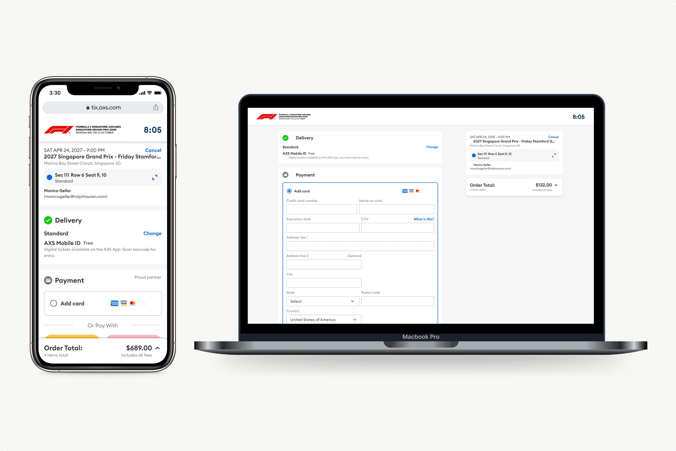
Legacy checkout ran five pages after ticket selection with sign in inside the delivery page. The redesign moved sign in ahead and collapsed the rest to one page.
Legacy
Single page checkout
Five pages after ticket selection collapsed to one. Sign in moved out of the delivery step and ahead of checkout.
My role
End-to-end ownership
I was the lead designer on this project and owned UX end to end, from discovery through rollout.
I ran stakeholder discovery alongside our PM, covering 25 interviews across Ticketing Strategy, Sales, Sponsorships, Finance, Account Management, and global teams. I focused on workflows and UX implications while our PM went deeper on commercial requirements. From there I owned the information architecture, the interaction model, the modular framework, and the design decisions underneath it.
Engineering and QA were not downstream on this one. They surfaced legacy behavior, data limitations, and edge cases that were invisible from the interface, and several of those became design decisions. I partnered with a UI designer on visual refinement and kept the system logic with me.
Foundations
Checkout is a system, not a flow
Before designing anything I needed to understand why the existing checkout behaved the way it did, so I mapped it. Thirteen dependency domains resolve inside a single purchase surface, from ticket inventory and pricing through market localization and accessibility policy. Change one variable and several others move with it.
Thirteen dependency domains resolve inside one purchase surface. Open full size to read the detail.
Most of those domains constrain the design without driving it. Three drove almost every structural decision that followed.
System dependencies
- Client contracts and market rules→payment configuration
UX implication
Keep one payment interaction. Let contents, ordering, and prominence vary by client.
- Inventory model→system representation→event information
UX implication
Build purchase context from what the system can reliably identify, not from what a fan intuitively expects to see.
- Held inventory→checkout state→timer
UX implication
One global timer spanning the purchase, replacing page-specific timer behavior.
The principle I took out of it: translate system complexity into understandable UX without pretending the constraints are not there.
Discovery
What 25 interviews agreed on
I ran discovery across ticketing strategy, sales, sponsorships, artist services, account management, and global teams. I expected the hard part to be reconciling conflicting priorities. It was the opposite.
Every group wanted the same outcome. The disagreement was never about the goal. It was about the specifics underneath it, and each of those specifics was governed by something outside design.
Stakeholder discovery
Converged
Raised independently by every group
Fewer clicks and steps to purchase
Less hesitation between pages
Mobile first, weighted by market
Less time holding scarce inventory
Varied (emphasized)
And what governed the variation
Payment order and prominence
Sponsorship and commercial agreements
Upsell placement and ordering
Venue merchandising control
Delivery methods
Market and client requirements
Confirmation page content
Legal and regulatory requirements
Synthesis from 25 stakeholder interviews across six functions and three regions.
That split set the design direction. The experience could be one thing. The rules underneath it could not.
The framework
Standardize the experience, configure the rules
The central decision was not a layout. It was deciding where consistency created value and where variation was unavoidable.
Structure, hierarchy, module behavior, timer model, and the checkout interaction stay the same everywhere. Payment configuration, delivery options, legal text, translations, and which modules appear can all vary.
That distinction is what kept this from becoming a fourth checkout flow. Anything that varied by client became configuration inside one framework instead of a reason to fork.
Explorations
From radical minimal to accordion
My first concept was radically minimal. One screen, nothing extra. Engineering pushed back and they were right. The flow had to handle multiple ticket types, insurance add-ons, accessibility holds, and a long tail of payment edge cases. So I explored two structures instead.
Two page checkout
Split by commitment
Selections, then payment and review
Fewer pages than the legacy flow
Simpler to build
Less state to hold in one place
Dependencies frozen at the page boundary
A page two choice cannot change a page one selection
Single page, accordion sections (emphasized)
One continuous state
Modular collapsible steps
Each section configurable per client
Every dependency resolves live
Nothing frozen across a boundary
Required an explicit continue per section
Changed later
Both directions wireframed, with the dependency breaks marked.
The accordion won on dependency logic. Insurance eligibility depends on the payment method selected. Delivery options change when add-ons are in the cart. A two page split freezes those relationships across a page boundary, so a choice on the second screen can invalidate one made on the first. One page let every dependency resolve live.
The approach
One page, login out of the flow
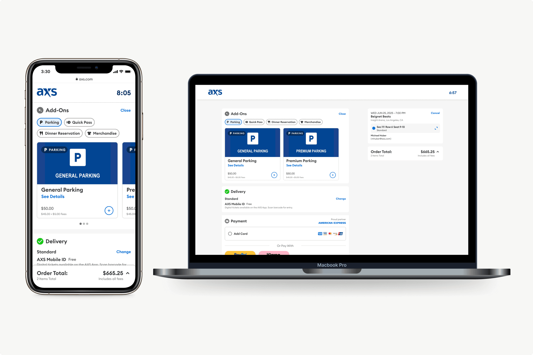
Progressive disclosure came out of the accordion. The core flow stays light and complexity surfaces only when a transaction needs it. A single global timer replaced page-specific timer behavior, so one hold spans the whole purchase and inventory moves faster during high-demand onsales.
The structural change was collapsing five pages into one. The old version buried sign in inside the delivery step, page two of five, which stalled people right after they had committed to a purchase. AXS requires an account to buy tickets and guest checkout was not on the table, so instead of removing the constraint I moved it in front of checkout. Once the purchase starts, nothing interrupts it.
Add-ons had their own page at the front of this flow. Replacing it with modular cards inside the purchase became its own project.
Research
What testing changed
We tested the concept with 15 participants across three age cohorts. It rated 3.9 out of 5 on ease of use and 3.9 on clarity, holding above 3.6 in every cohort.
What validated
Signals that confirmed the approach
Read as a familiar retail checkout, not a ticketing flow
Compared unprompted to shopping carts and online storefronts
Most named no barrier to completing a purchase
Final review showing everything at once was called out as a positive
What needed work (emphasized)
Barriers participants named unprompted
Insurance sat after payment. Most expected it earlier
Delivery information read as out of order
Unclear what was required before the order could be placed
Add-on labels and button copy caused hesitation
The useful finding was not about speed. Every friction point participants named was about sequence and certainty. They needed to confirm what they were buying before they would move on. Under onsale conditions that is not a preference. It is a rational response to the risk of losing the seat. I had been optimizing for fewer decisions, and the research showed that stripping information out indiscriminately worked against the thing I was actually trying to do, which was get people through checkout. So I raised the prominence of ticket and seat information at the top of the flow.
Two things then converged on the same problem. Participants were unclear on what was required before the order could go through, and leadership pushed on the same friction from the other direction. The accordion originally required an explicit continue on every section. We replaced it with smart advancement that moves the flow forward when intent is clear.
Scope
Scoping to Single Offers
Mapping the framework against real purchase scenarios made the configuration space obvious. Festivals, multi-event purchases, and Fixed/Flex offers behave differently enough that supporting everything at launch would have meant validating nothing.
We shipped Single Offers first. Establish the framework, validate the interaction, measure it, then expand. Multi-Event, Bundle, Season, and Shopping Cart followed on the roadmap once the foundation held.
Experimentation and adoption
Shipped as a hypothesis
The redesign went live as a controlled A/B test in Adobe Target, running 37 days across four purchase contexts. I built the experiment framework, defined the variants, and set success metrics with our PM.
Overall checkout conversion improved 6.5 percentage points. Mobile moved 11.0 points, desktop 2.3. The gap is the story: mobile carried the most traffic and the most friction, and it absorbed most of the gain. The variant beat the control in both Pick a Seat and Best Available contexts.
Conversion was not the only signal. Single Page Checkout reached 97% adoption across events using Single Offers globally. That mattered more than the test result, because the project started with several parallel checkouts creating inconsistency and maintenance load. High adoption meant the framework had actually replaced them.
Conversion lift, percentage points
Conversion lift in percentage points. Mobile 11.0, overall 6.5, desktop 2.3.
- Mobile+11.0
- Overall+6.5
- Desktop+2.3
37-day controlled A/B test across four purchase contexts. Mobile carried the most traffic and absorbed most of the gain.
SYSTEM IMPACT
Patterns that outlasted the project
When I started, AXS didn't have one design system. Different teams were building off different component libraries, so the same elements looked and behaved differently depending on where you were in the product. The patterns I built for this checkout became the foundation for consolidating those into a single global system.
Every module carries the same contract: an active state for input, a summary state that stays editable, and its own validation. Payment forms, add-on cards, and confirmation states were absorbed as foundational components, which meant other teams inherited the decisions without inheriting the flow.
A checkout redesign turned into the starting point for unifying how the platform builds UI.
Every module carries the same contract: an active state, an editable summary state, and its own validation. Open full size to read the callouts.
REFLECTION
What I learned
My first concept was too stripped down
I ran one test when I should have run four
More Work