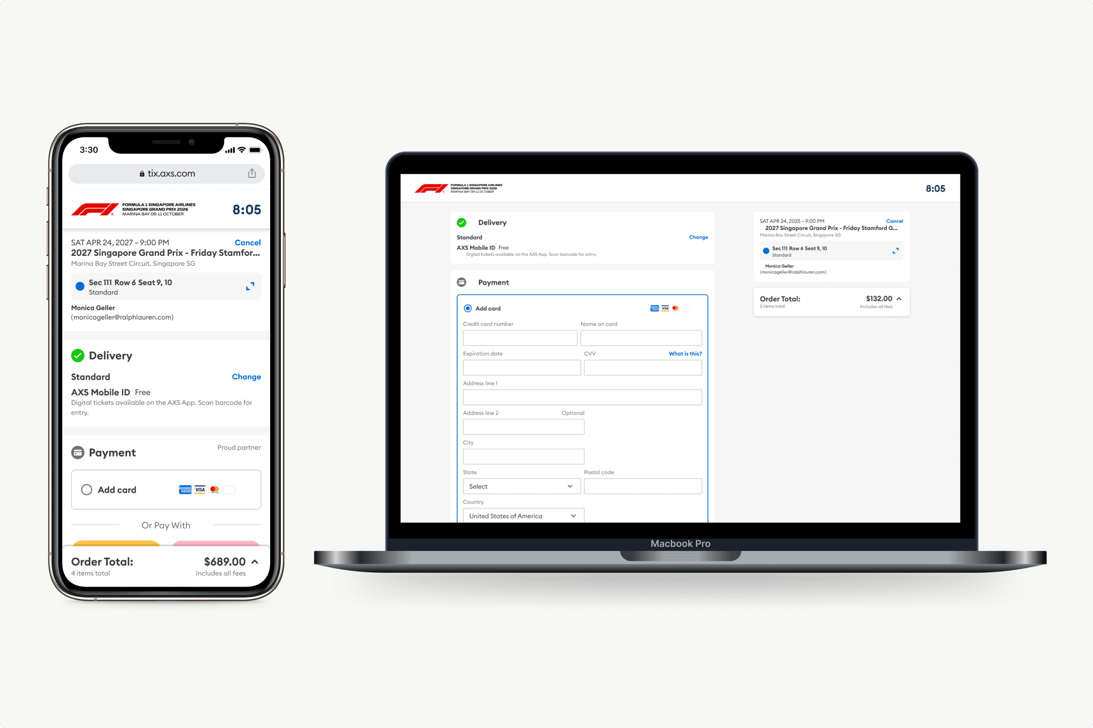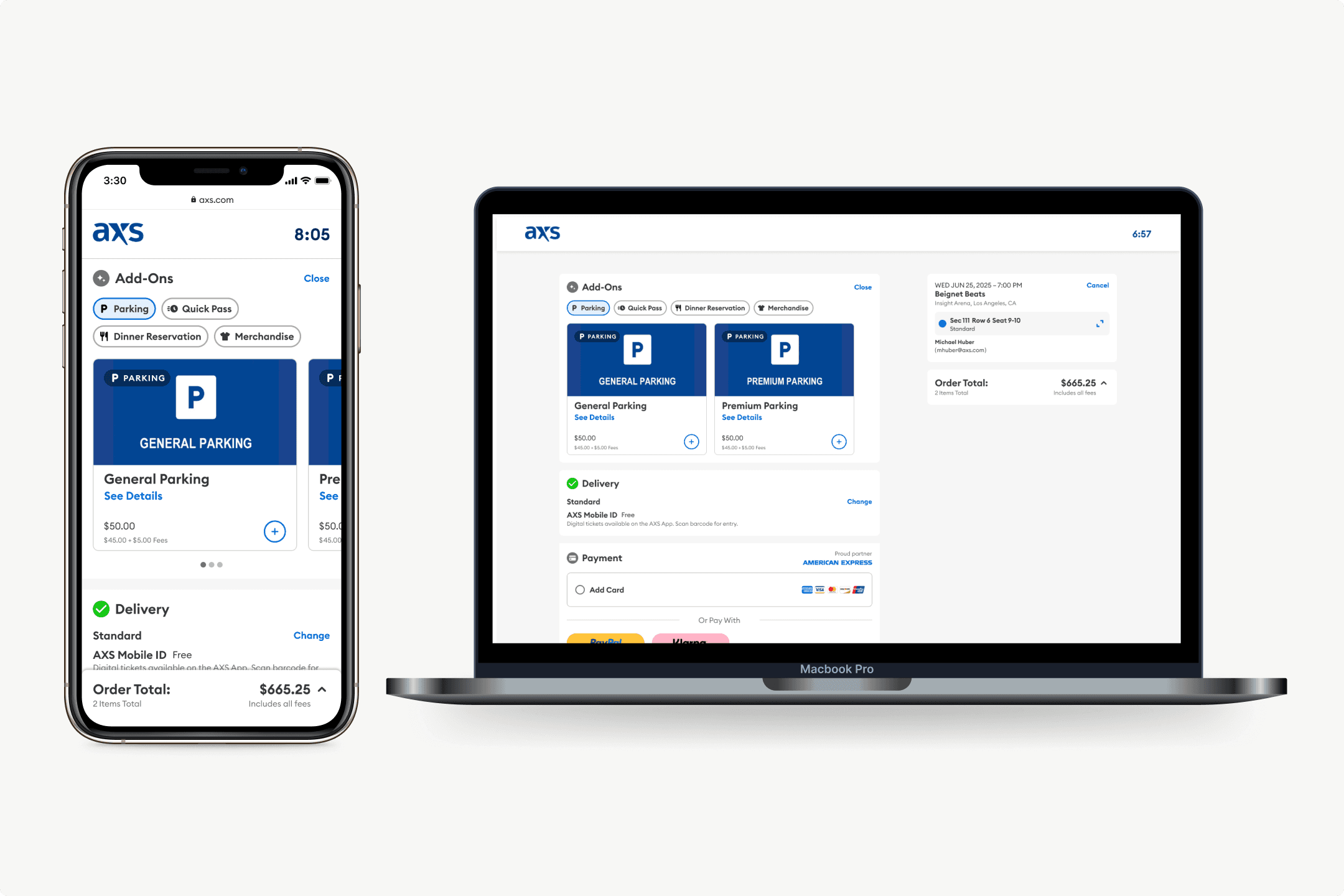
The redesigned add-on cards, live in the purchase flow
AXS
Doubling add-on orders with in-flow placement
AXS had parking passes, VIP upgrades, and quick passes available at purchase, but they lived on a separate offer page that most people skipped. I replaced them with modular add-on cards embedded directly in the purchase flow.
MY ROLE
Sole designer, research through launch
I ran this from research through launch: concepts, specs, and experiment design. I worked with the PM and engineering team throughout, and pulled in AXS's client-facing team to understand how add-on relevance varied across event types and venues.
THE PROBLEM
The offer page wasn't the problem. The placement was.
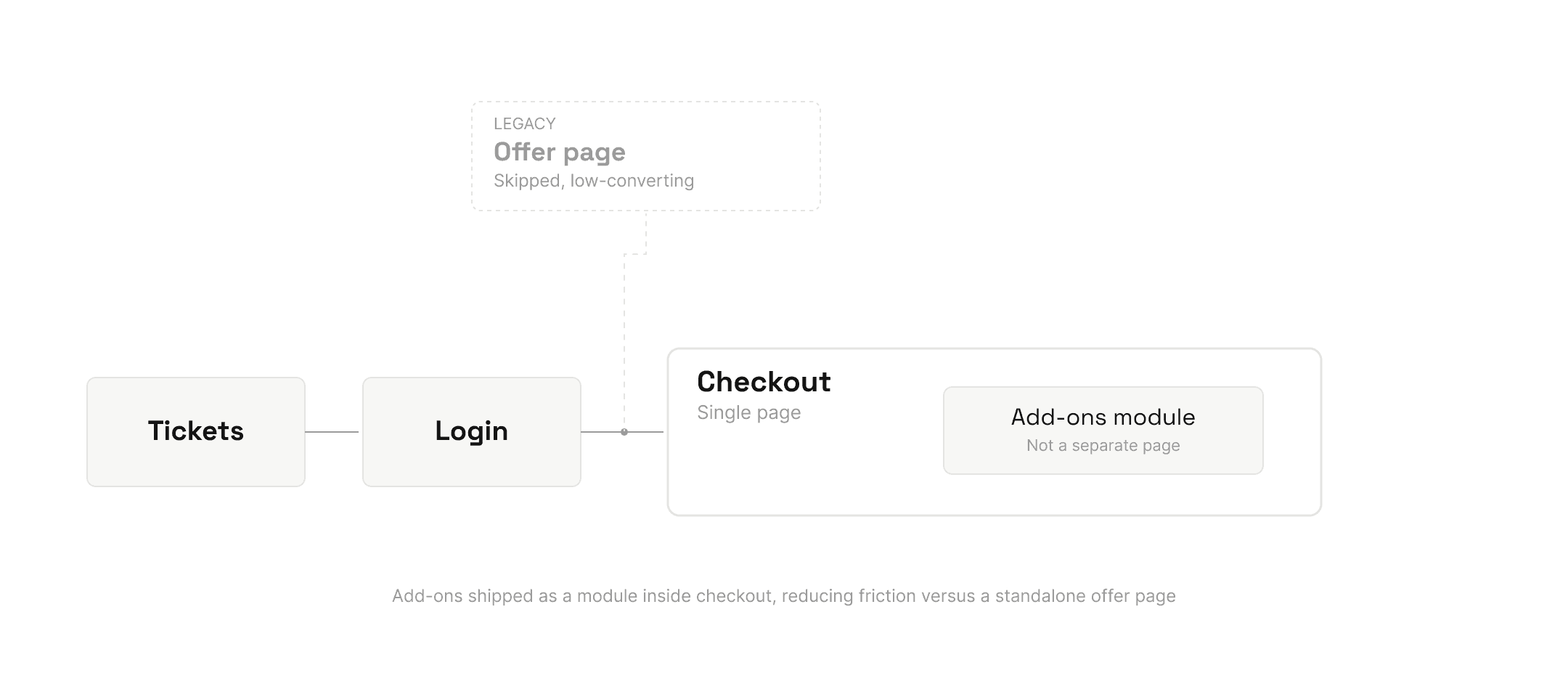
AXS offered add-on products (parking, VIP upgrades, quick passes) but buried them on a standalone page that appeared after ticket selection. It felt like an interruption. Most people skipped it. Attachment rates were low, and when users did engage, conversion was poor.
For AXS's clients (venues, promoters, sports teams), add-on revenue is pure margin on top of ticket sales. The products weren't the issue. The problem was timing: an offer page that shows up after someone has already mentally completed their purchase is fighting an uphill battle. The question was where in the flow add-ons actually made sense.
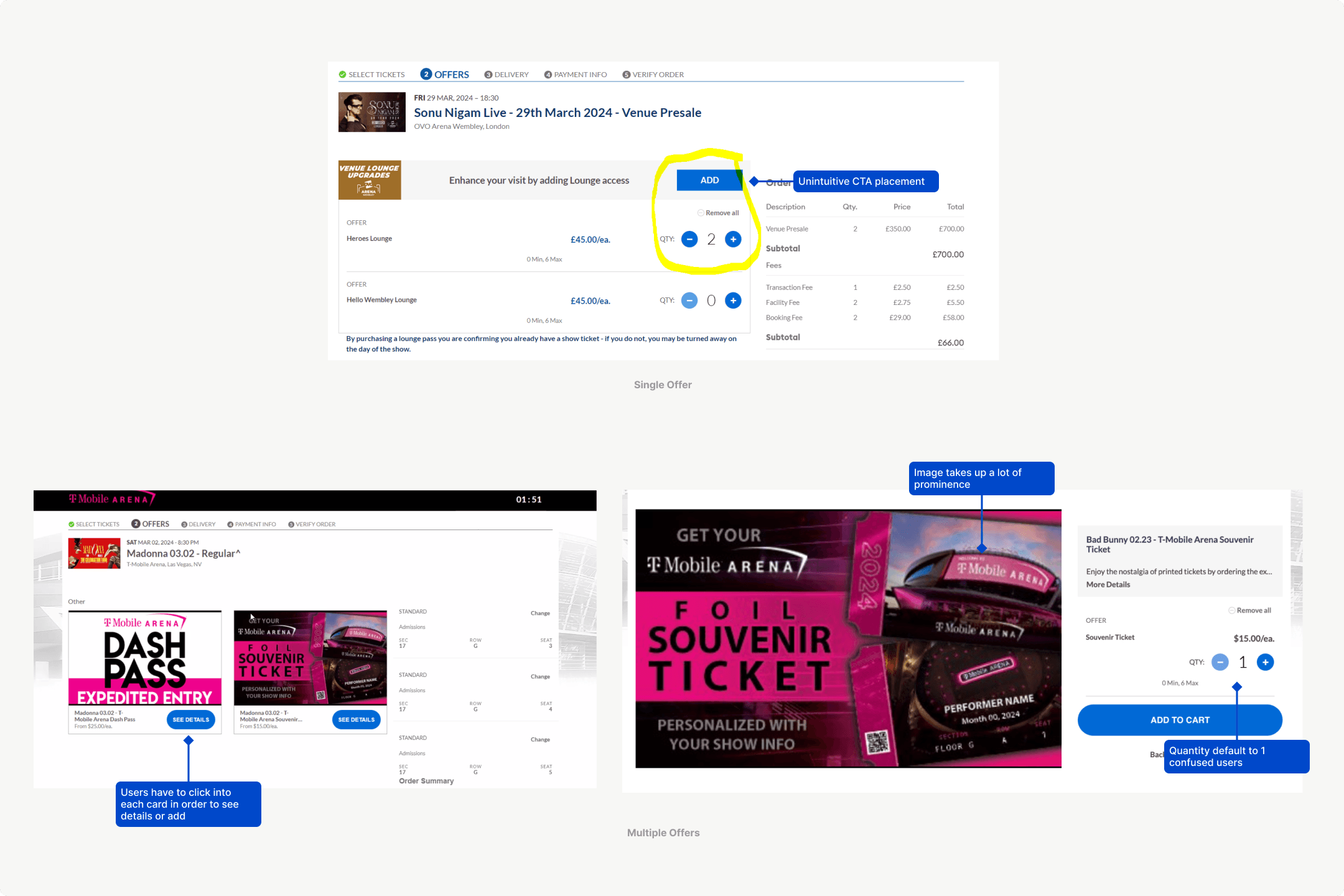
The legacy offer page: buried after ticket selection, easy to skip
DISCOVERY
Where users expected to see them
I ran a card sort to understand where users expected add-on offers to appear and which formats felt natural versus pushy. The results were clear: people were receptive to add-ons when they appeared alongside ticket selection, not after. An offer at the right moment is a convenience. The same offer on a separate page after the fact is an obstacle.
I also looked at how the existing offer page performed across different client properties. It was skipped entirely on most visits. When users did engage, they rarely converted. The page wasn't underperforming because the products were unappealing. It was underperforming because it showed up too late and in isolation.
THE DESIGN
Modular cards, in-flow, configurable per client
I replaced the offer page with modular add-on cards embedded directly after ticket selection, before checkout. Each card had a product name, price, short description, and an add-to-cart action. For products that needed more context (like VIP tiers with multiple options), a "See Details" interaction opened an expanded view in-place, so users never left the flow to learn more.
The architecture was designed to be configurable. Different clients could set which add-ons appeared, in what order, and at what price. That made it possible to roll out across AXS's full client base without custom design work per property:
A parking pass matters a lot more at a suburban amphitheater than a downtown arena. The system needed to handle that variance without becoming a one-size-fits-all compromise.
Testing add-on placement within ticket selection before landing on checkout
With placement settled, the question shifted to the cards themselves: how much to show upfront, and how much to tuck behind See Details.
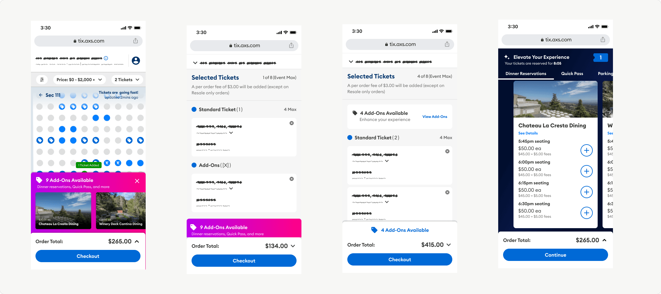
Exploring card layout and density before the final pattern
EXPERIMENTATION
30 days across 5 properties
The new architecture launched as a 30-day A/B test across 5 AXS client properties. We tested across multiple clients because add-on performance varies enough by event type that a single-client test would have been misleading.
After the initial test, I ran multivariate experiments on card ordering, pricing display, and visual treatment. The data fed back into the design, and the results shaped which add-on product types AXS invested in building out next.
SYSTEM IMPACT
A template the whole flow reused
The modular card became the standard template for any commerce surface in the AXS purchase flow. When new add-on types were introduced later, they slotted into the existing architecture. No new design work required.
REFLECTION
What I learned
Placement was a research question, and we were treating it as a taste question
The modularity was the product, not the cards
Knowing which numbers were mine to defend
I owned
UX metrics: speed through the flow, drop-off at each step
PM and data scientist owned
Conversion, AOV
That split sounds obvious written down, but it changed how I argued in reviews. I stopped claiming credit for revenue movement I couldn't isolate, and I got a lot more traction on the metrics I could actually explain.
More Work